Does Your Copy & Design Mesh Well Together?
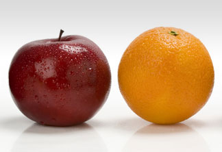 To make a truly effective printed piece your visuals must blend well with the copy. We've all seen advertisements with inappropriate illustrations, photography that was out of focus or images that were far too little, or that had far too much copy. But perhaps worse is when the message of the visuals does not quite match the copy content.
"I guess I should read it."
I struck up a relationship with a copywriter and we worked on many projects for a number of clients over a number of years. Unfortunately she retired. We made a good team and had clients in Texas, New Jersey and Florida. These clients really appreciated the level of quality and expertise that we brought to every project, and gave us pretty much free reign on them.
At one point while we were working on a project the copywriter called and said the graphics were spot on in an article that I just designed. I thought it a little strange that she made a phone call just for that. In the course of the discussion she relayed that with another designer she had worked with in the past, she had mentioned to him that she had won an award for the copy content of the article. The designer proceeded to say that they would go back and read the article!?!?
I was a little dumbfounded hearing her relate this and thought, "How do you design an article where the graphics are so generic that they "work" without relating to the copy?" Graphics in any print material should reinforce the copy — and vice versa. There should be a cohesion between the two and the end result makes a stronger impact.
Graphics do matter and should reinforce the copy content.